Configuring the Content of a Tree-view
The content of a Tree-view control is defined using a table in the control's Content tab.  Show picture

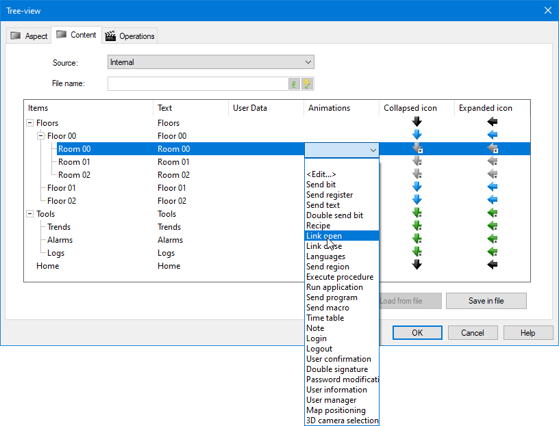
Each row in the table represents a node in the form control. In a Tree-View the items are known as nodes. The table has the following columns.
- Items - A representation of where the node will appear in Tree-view control at run time.
- Text - The text representing the node that is displayed at run time. The Text field is bilingual.
- User Data - Text that can be linked to a variable.
- Animation - The animation that is activated when a node is clicked at run time. The animation is optional.
- Collapsed icon - The icon displayed when a node is collapsed. Optional.
- Expanded icon - The icon displayed when a node is expanded. Optional.
Editing a node in the table
To edit, add or delete a node, right-click in the table and select one of the following commands from the context menu.
| Command | Meaning |
| Add root | Add a new node at the top level (from any level). |
| Add child | Add a new node beneath the selected node. |
| Remove | Delete the selected node and any sub-nodes. |
| Move up | Exchange the selected item with the one before it in the list. |
| Move down | Exchange the selected item with the one after it in the list. |
| Use default collapsed icon | Replace the selected icon with the default one as configured in the Aspect tab. |
| Use default expanded icon | Replace the selected icon with the default one as configured in the Aspect tab. |
When you add a new node, it is created with default text in the Text field. This can be edited by first selecting the node and then double-clicking in the Text field. The User Data field is edited in the same manner.
Adding an animation to a node
The animations that can be added to a node are limited to those that result in a user action (Send, Run, Link and Security).
To add an animation to a node, select the node and then click the down arrow button next to the Animation field. Select the appropriate animation from the list that is displayed. Show picture
A dialog appropriate to that animation opens so that it can be configured. You can access the configuration dialog for an animation that has already been added using the <Edit....> option from the animation list.
How to customize node icons
Icons can be added to nodes, one displayed when the node is collapsed, another one when it is expanded. A default icon set can be configured using the Aspect tab. Icons for individual nodes can be customized using the Content tab.
The selected icons are displayed in the Content tab. Icons that display a small square adjacent to them are indexed icons. If an icon is selected for either the collapsed or expanded state and no icon is selected for the other state, at run-time the same icon is used for both states.
If you have customized an icon but want to return to the default you can right click the node and select Use default collapsed icon or Use default expanded icon from the context menu as appropriate.
Saving the Form Control's contents
The Form Control's content is saved and the configuration dialog is closed by clicking the OK button. By default, the content is saved with the Form Control's configuration in the mimic. To save (or load) the contents to (or from) a file see the topic Configuring a Form Control's contents from a file.